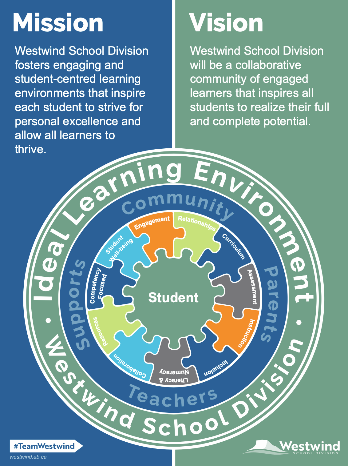
Creative Brief:
Westwind School Division (WWSD) serves students ranging from Kindergarten to twelfth grade throughout numerous rural schools. WWSD was requesting an update to their well-known brand to reflect changes within the division and to support new directions in technology and engagement in social media.
WWSD wanted to maintain familiarity but with a bolder, fresh mark that would allow for more versatility.
Solution:
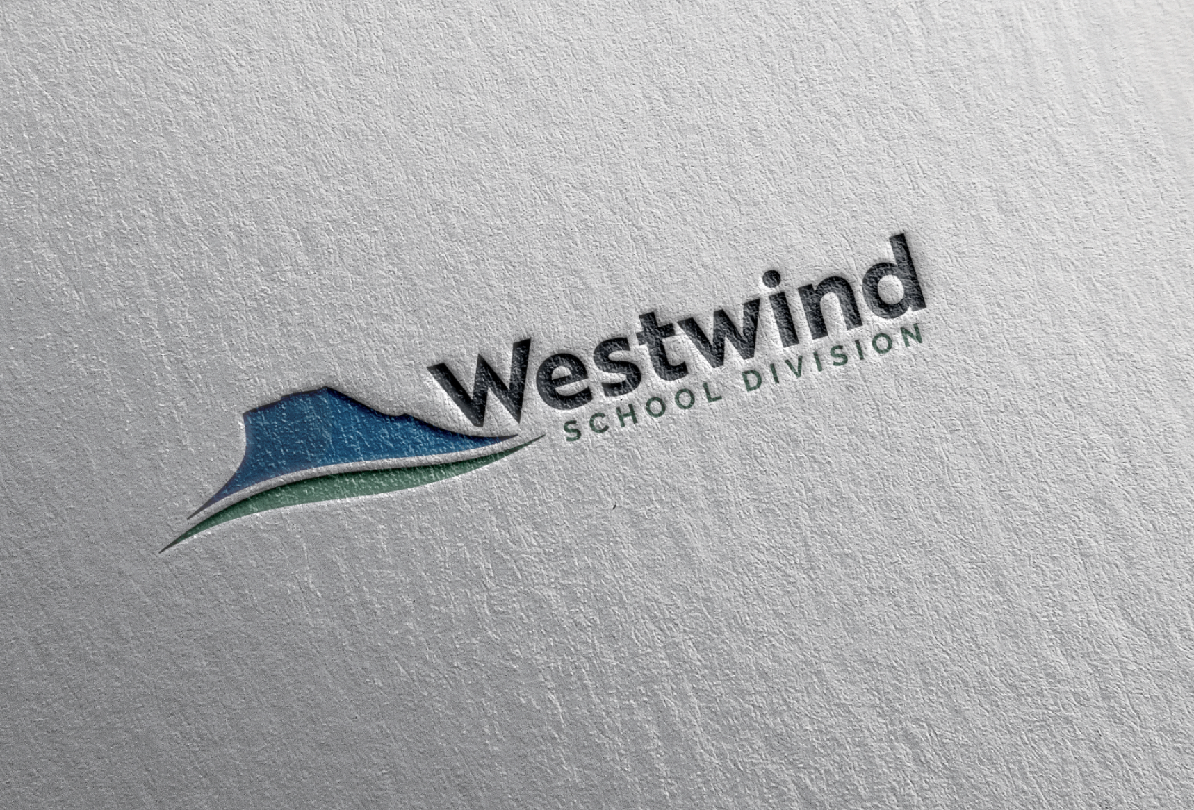
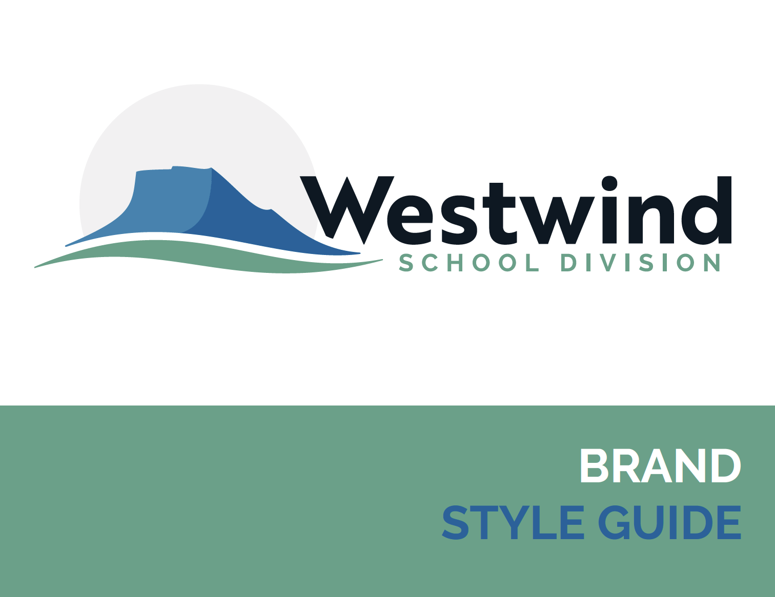
WWSD's previous mark was line work representing a revered landmark and local, First Nation sacred site, Chief Mountain. The landmark is visible from nearly every school location within the division.
The successful design was an update of this representation, moving to solid, bold colors and clean flowing shapes. The unique and easily recognizable blue shape of Chief Mountain rests on a flowing green line representing the foothills where WWSD resides under the watchful care of 'Old Chief.'
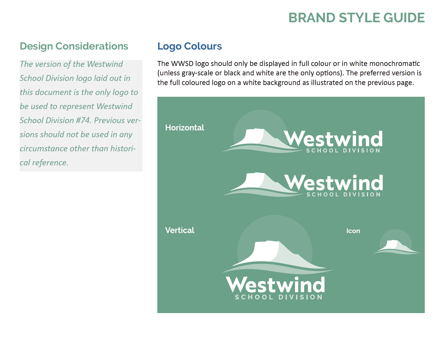
Both a vertical and horizontal iteration were developed to provide versatility to the design.
Process:
Feedback for this process came through surveys directed at stakeholders within the division, meetings with interested individuals, and direction from the school board and administration. Working closely with the division's communication officer was paramount. With a significant demographic of First Nation students and staff, it was important to include representation of this population in discussion.
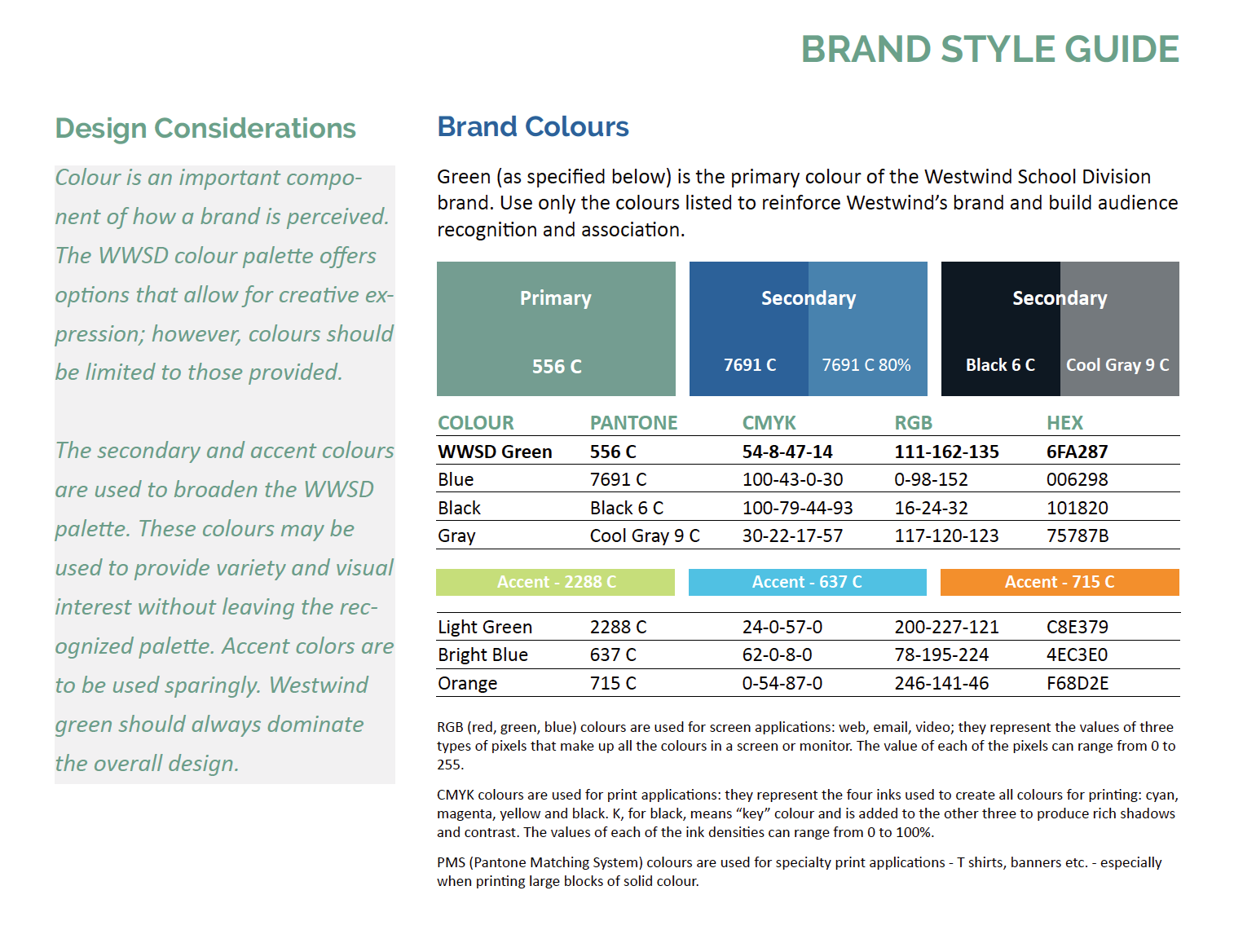
Three distinct concepts were proposed, feedback received on the decided upon logo, changes made with refinement, and colors explored and decided upon. The final iteration was approved, and plans for implementation were made and a multitude of assets were created to support the new brand.
Brand Consistency:
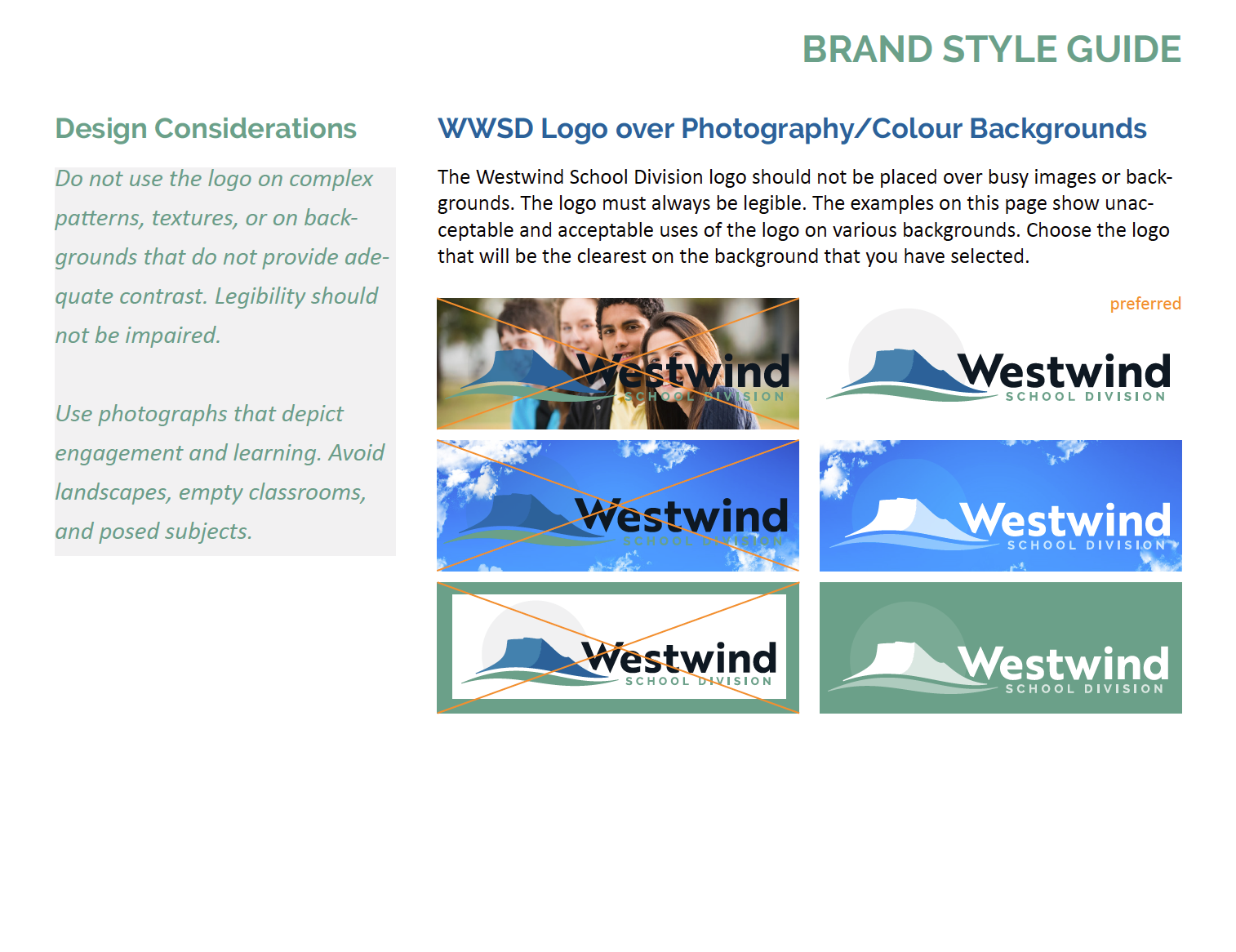
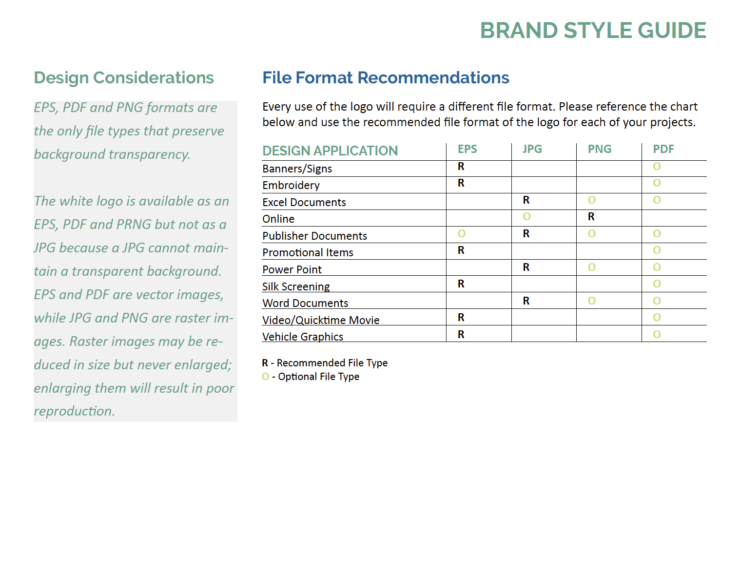
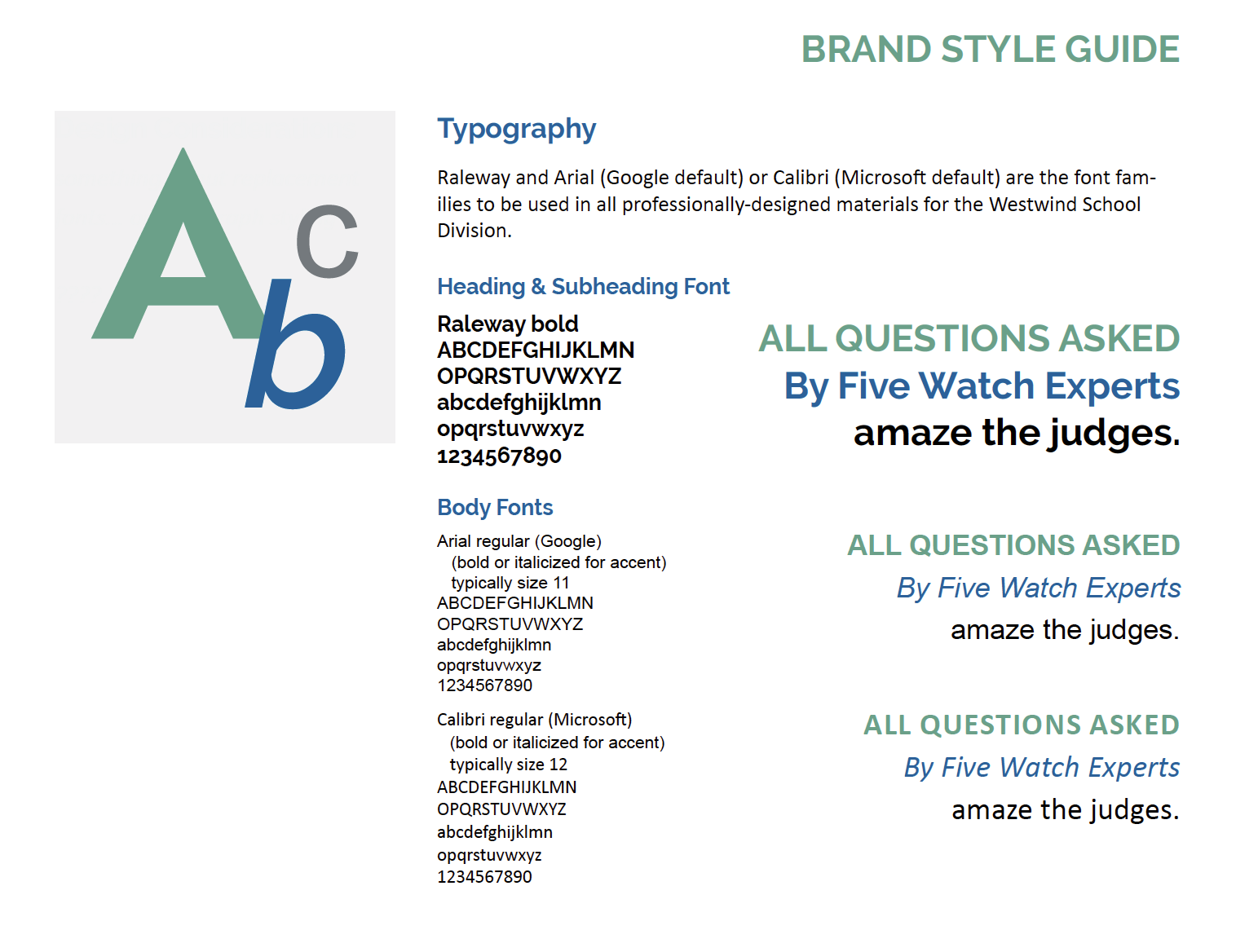
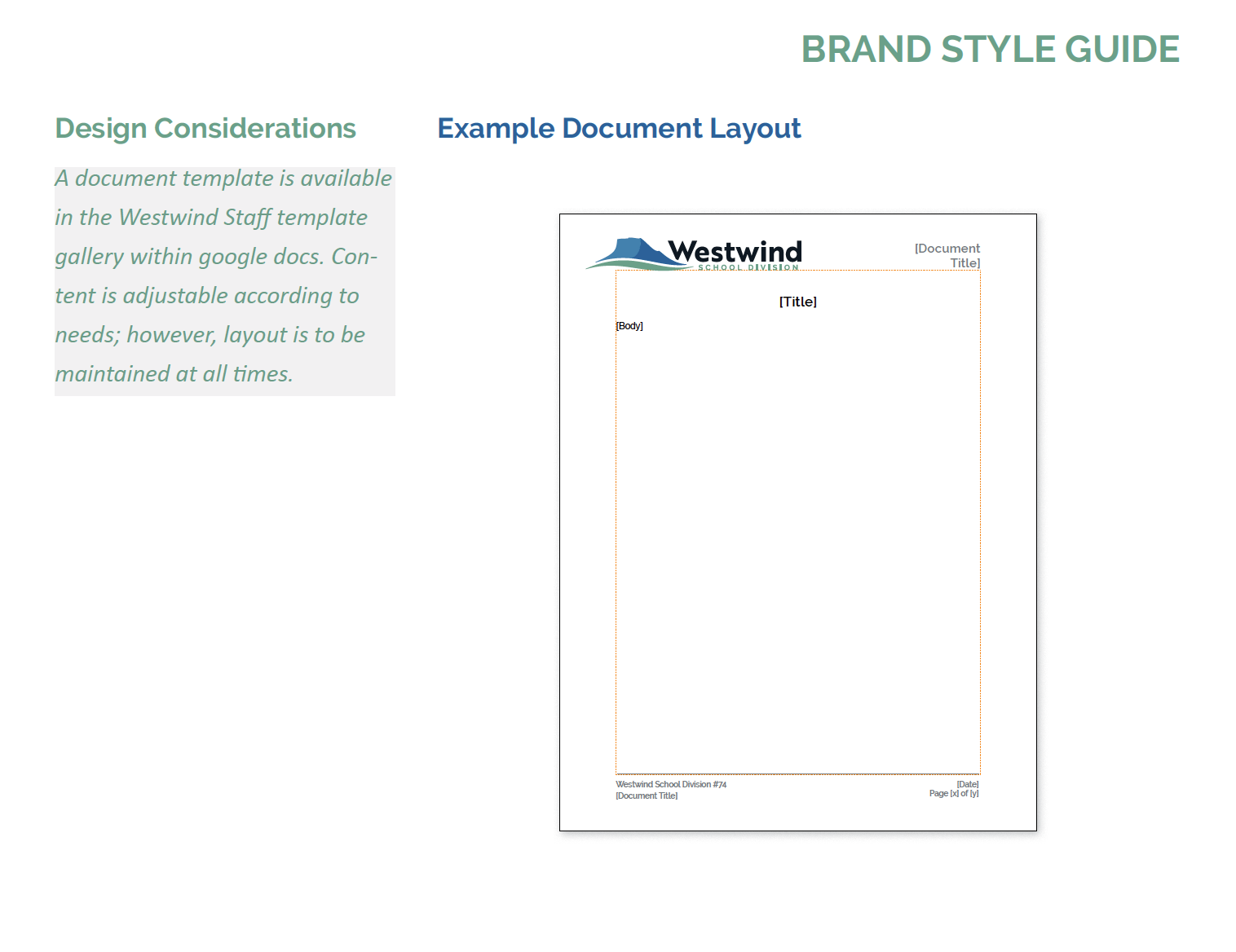
Among the assets created was a guide to direct use of the new brand across the division. The guide focuses on iterations and their usage, colors, the dos and do nots, typography, and acceptable applications in documents.
This type of tool was key for this large organization's maintaining consistency and building recognition in their new brand. It guided the development of a slew of assets over the first year and a half of the life of this new brand.


Asset Creation/Management:
A large scale organization such as a school division needs numerous assets to function. Applying the brand to development of these was a major task, and, thanks to collaboration with the division's communication officer and calculated planning and file management, numerous supporting designs were created and implemented.
Stationary, templates, apparel, signage, banners, posters, website support, social media graphics, and more were created to support the new brand, all based on guidelines set forth from the get go.