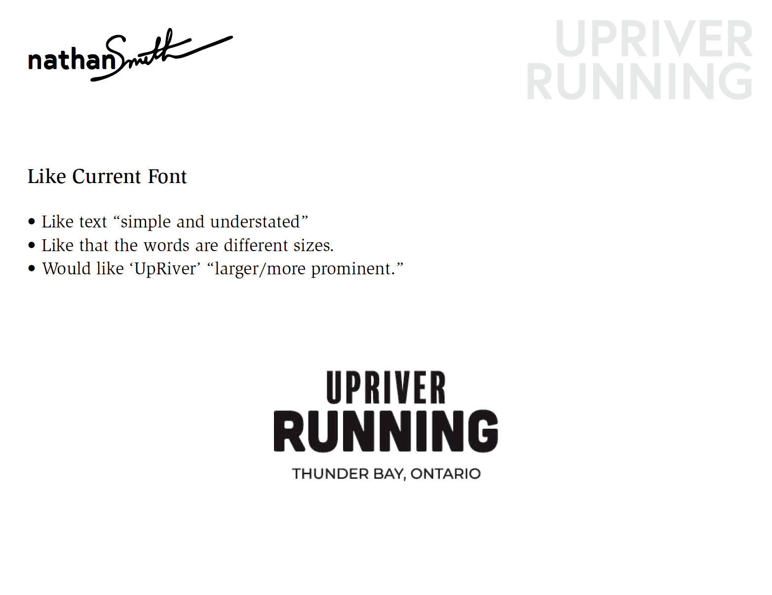
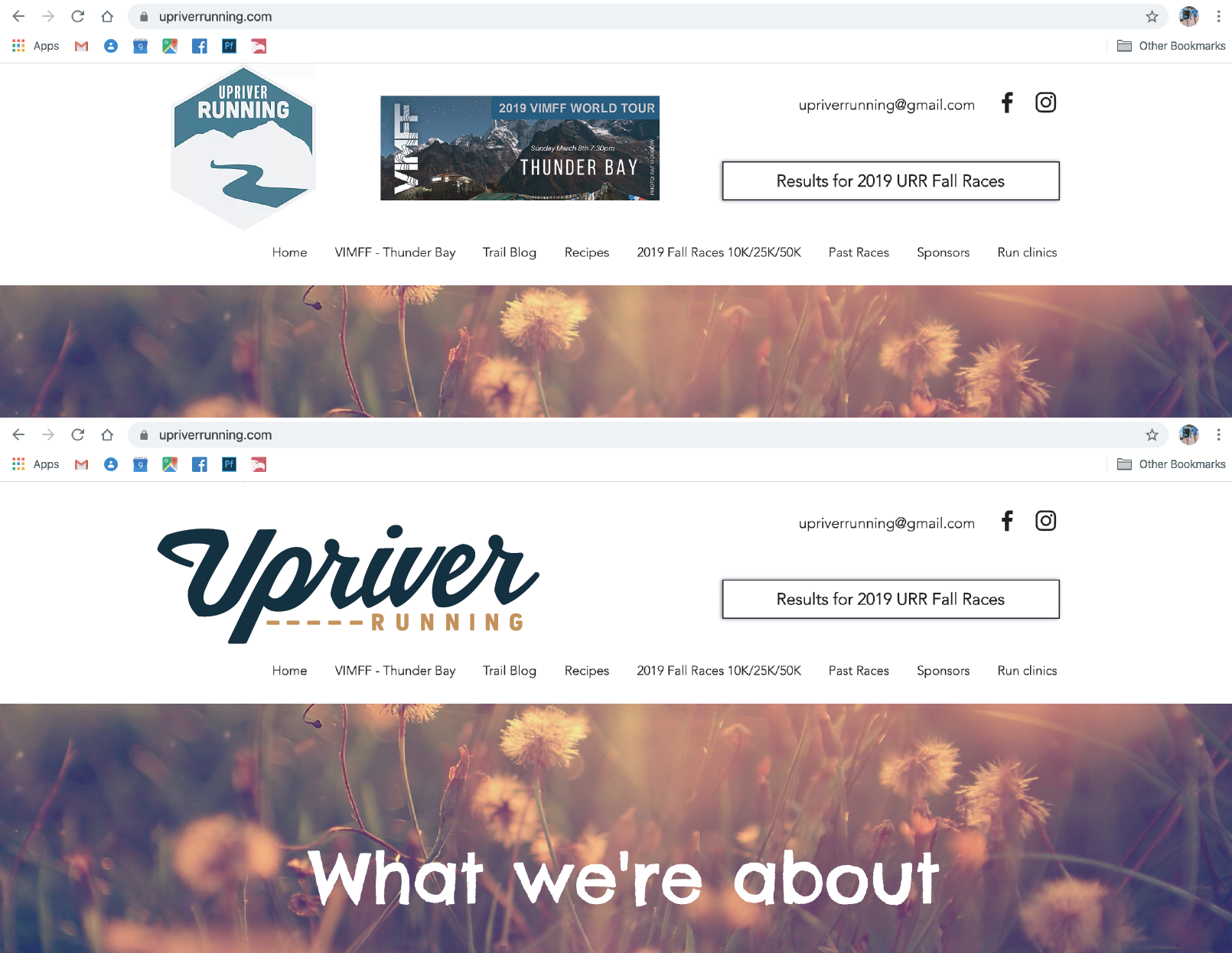
Creative Brief:
A “run touring” business based in Thunder Bay, Ontario was looking for a more professional version of their previous logo thrown together by a friend in a back room at start up. The existing mark was not a 'friendly' shape nor easily applied to some of the media interests of UpRiver moving forward. Its emasculation, with the sharp edges and square shape, did not resonate with the young women that made up most of the demographic of their clientele. Connection with the outdoors and something badge-like were important components moving forward for this trail race & running workshop hosting company.
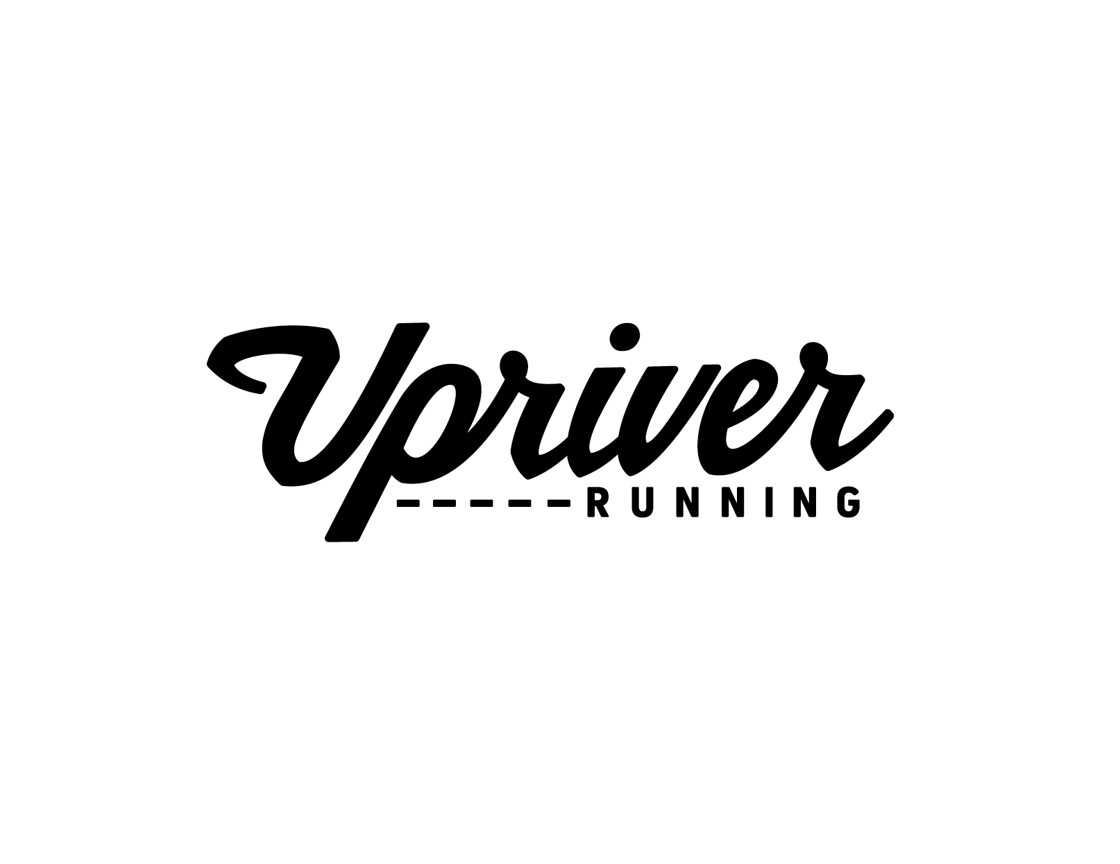
Solution:
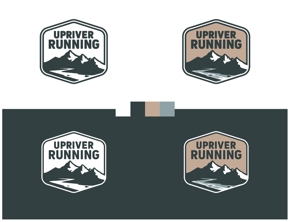
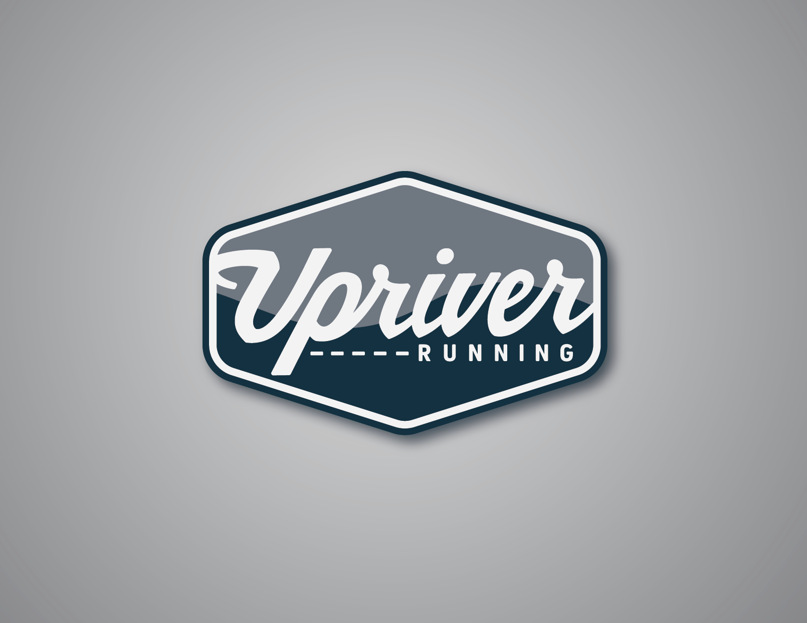
A softer, more refined logo with familiar characteristics was the answer.
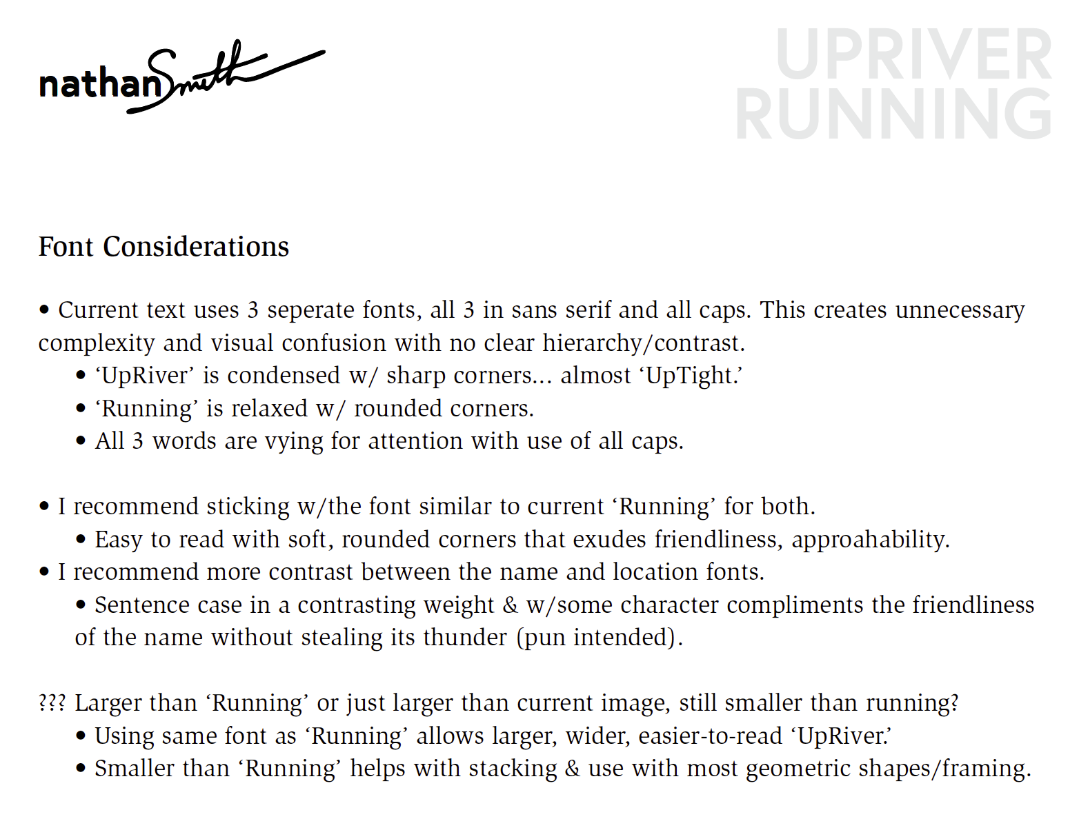
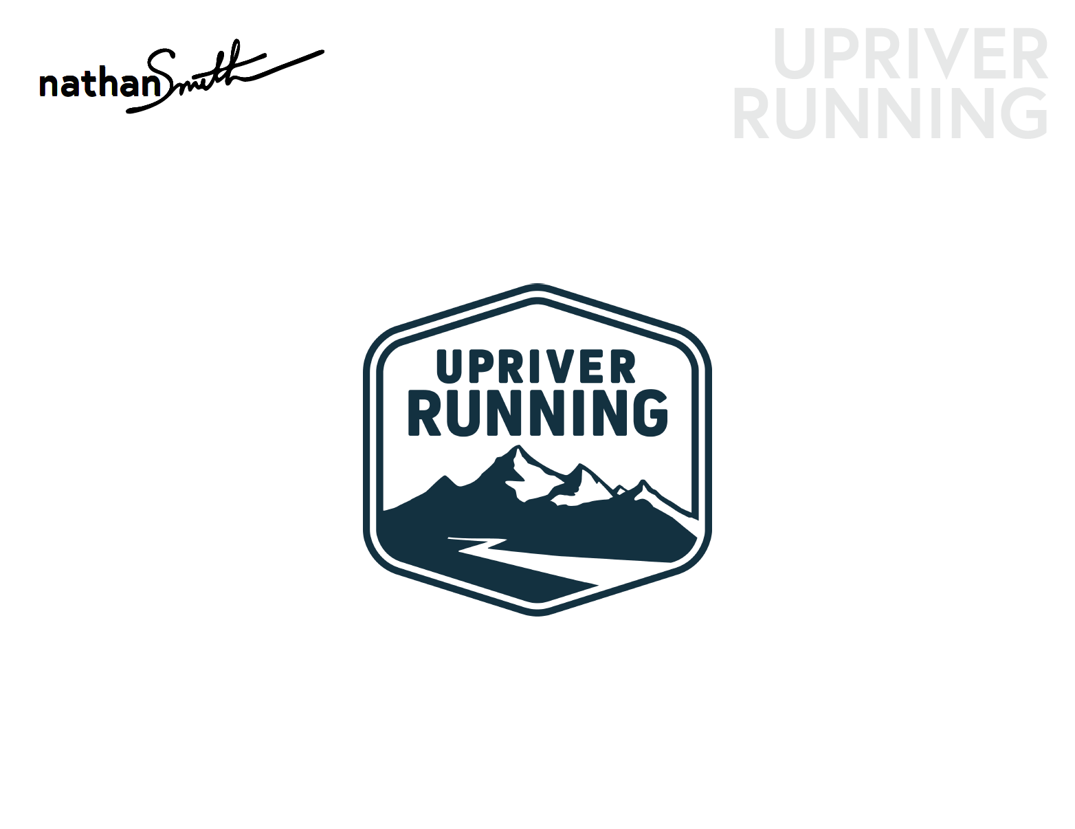
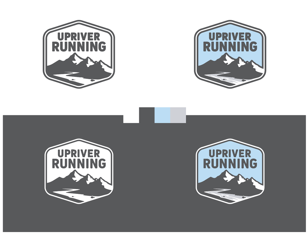
Corners were rounded to make the logo more friendly while detail in the mountains and in the water made the outdoors aspect more recognizable. The main typography was changed to one font with corners rounded furthering the mark's approachability .
Two hidden bird shapes in the mountain highlights are a nod to the two owners and their value of sharing perspective and freedom with others through education and building the outdoor community.
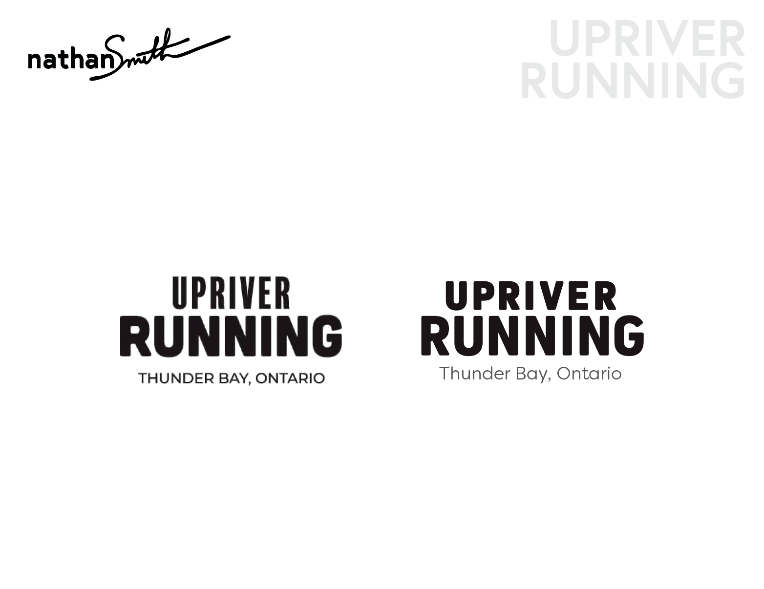
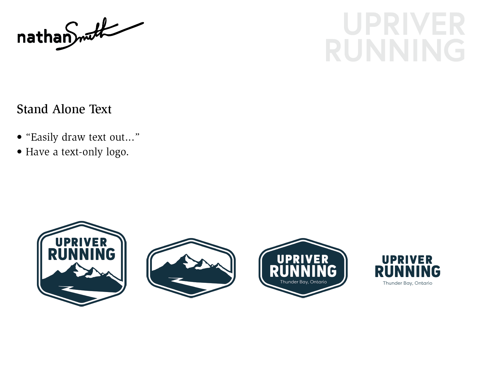
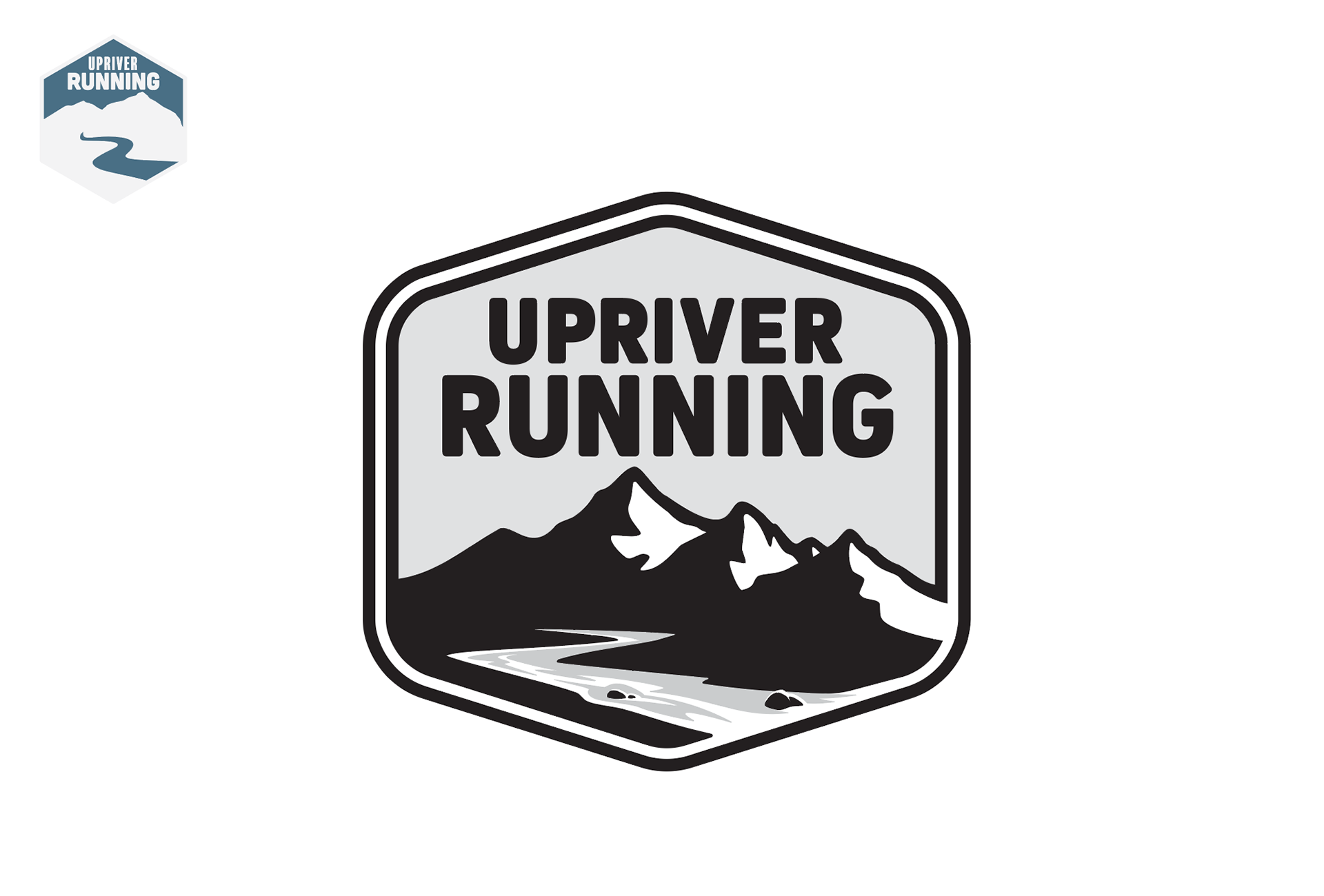
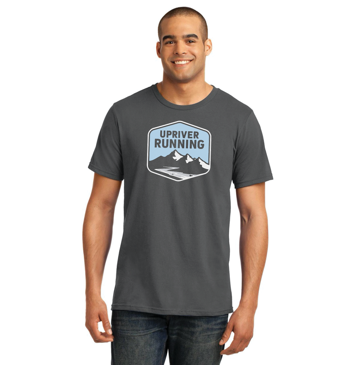
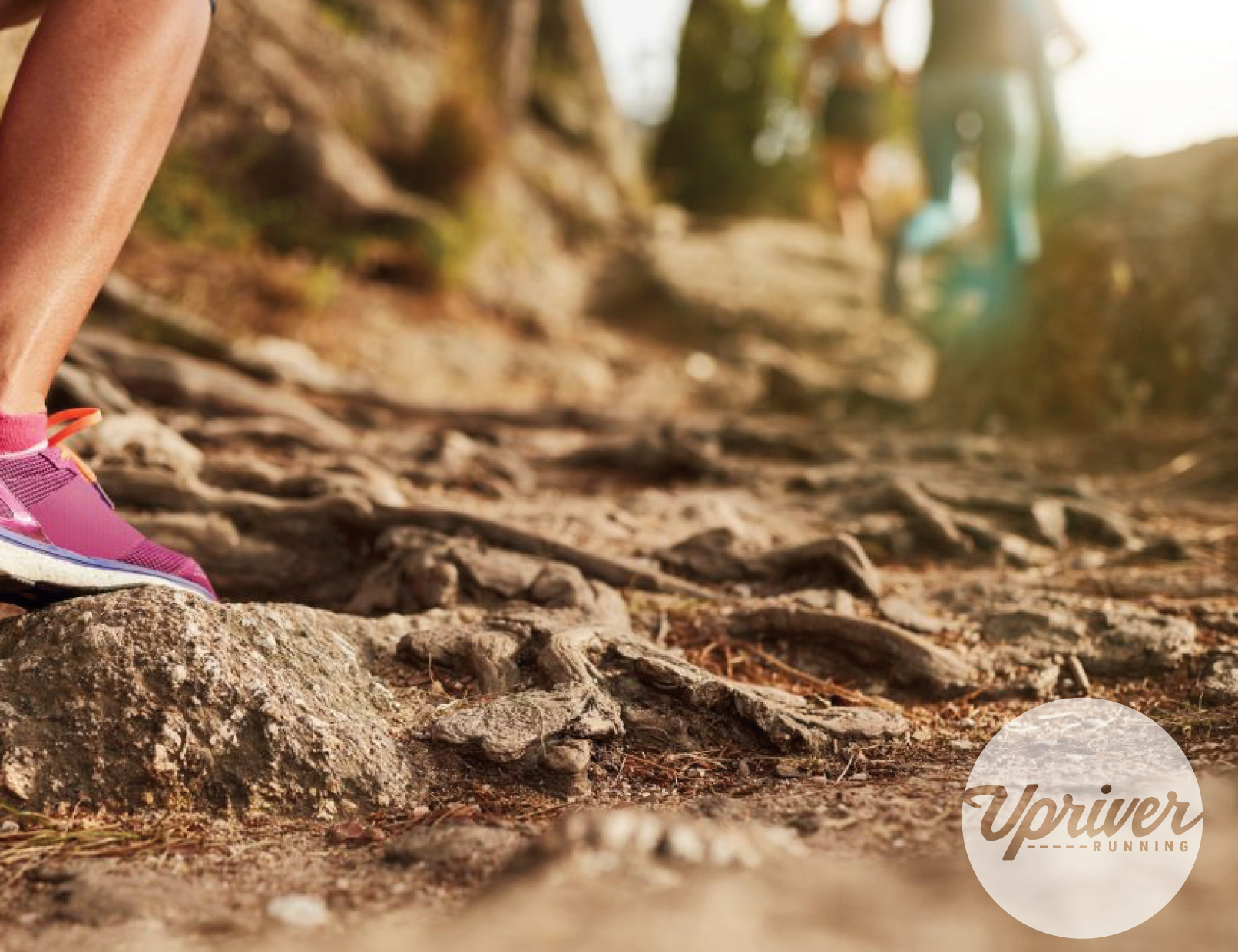
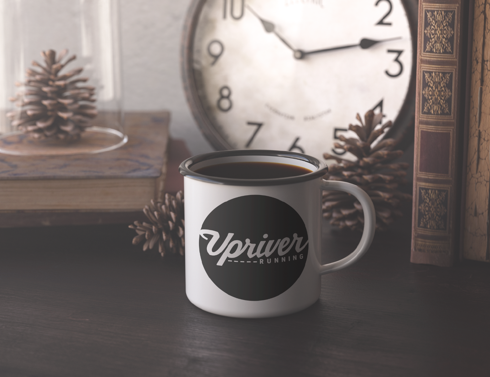
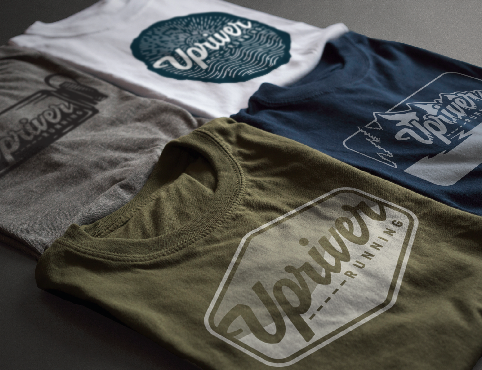
The shape was slightly elongated for added ease in applications such as a crest on a shirt, badge on a hat, or profile image on a website banner. A 'text-only' mark was also created for added versatility in applications (see feedback and revision notes below).
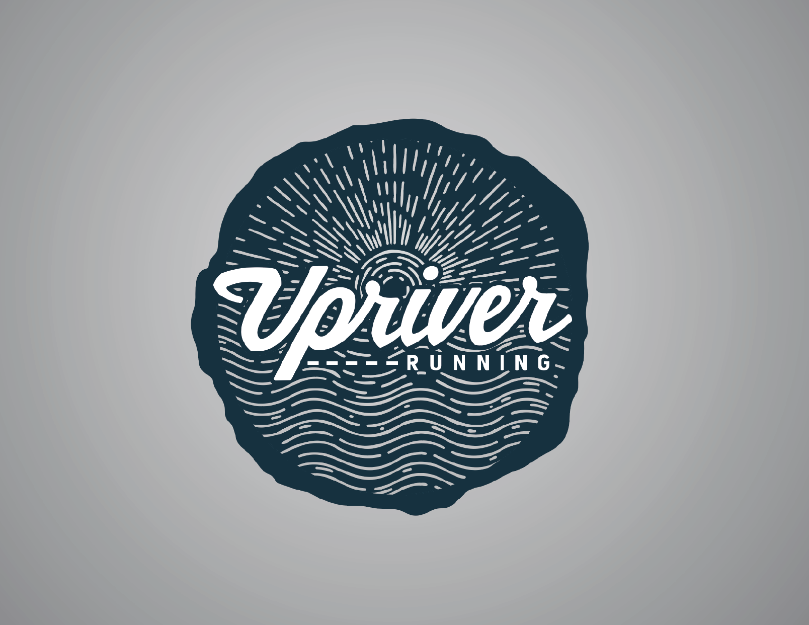
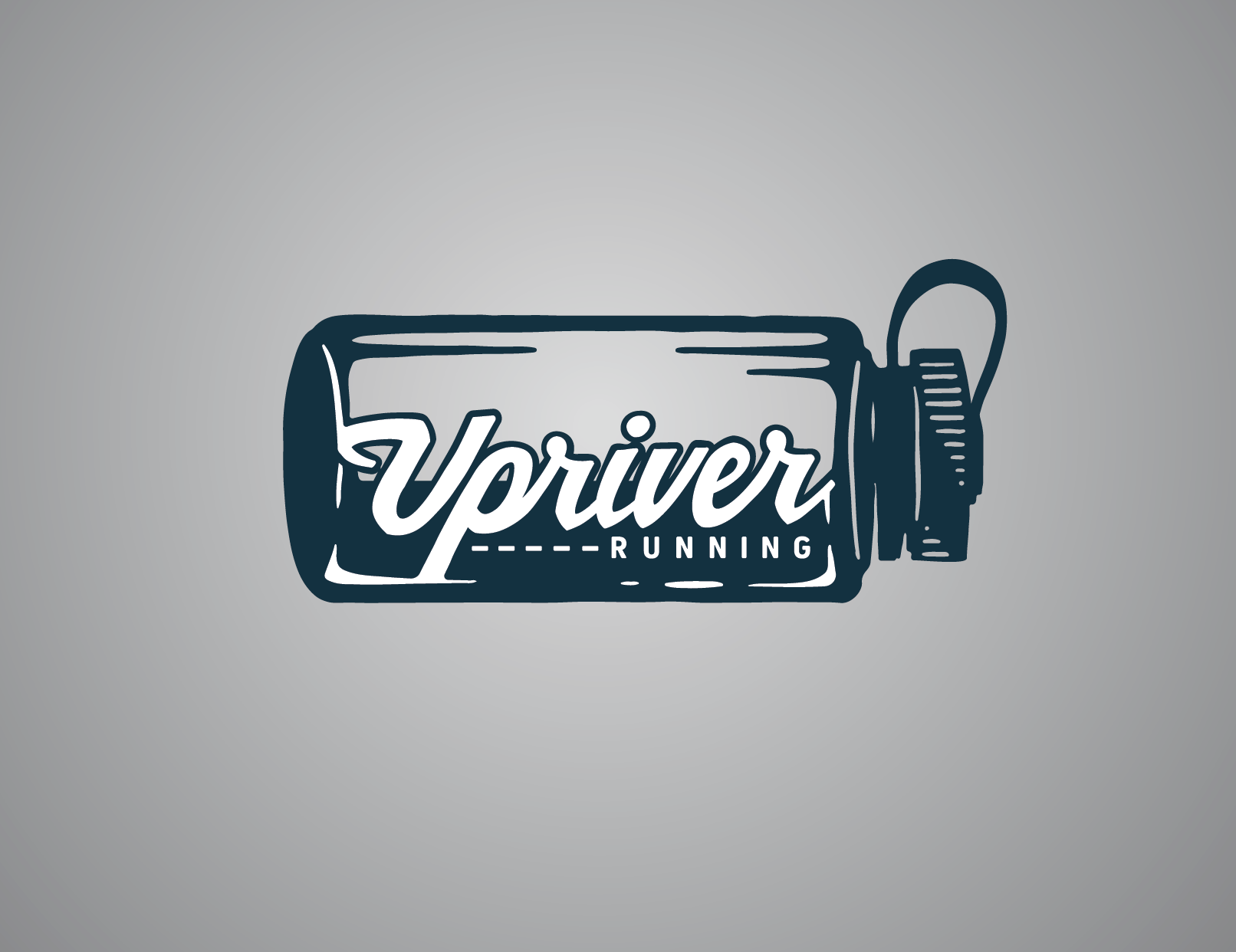
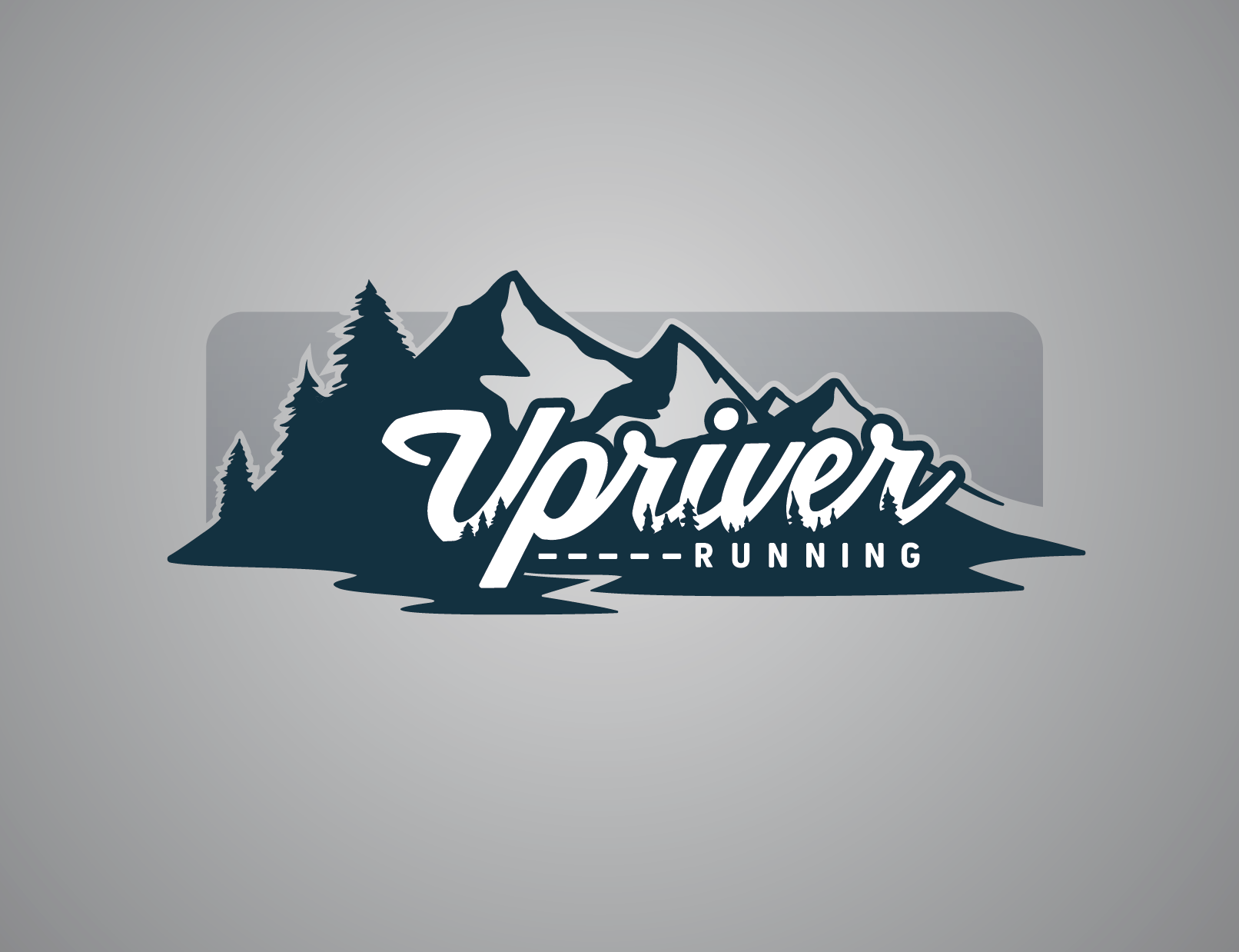
Process (initial proposal):
Note - the included photo grid contains detailed images and notes of initial proposal and hints to the process.
To start the process rolling, information was gathered through a creative brief questionnaire. Each of the owners provided guiding answers. Understanding the company's products, goals, audience, and needs was foundational. Added insight to style and 'feel' was also helpful to understand.
Brainstorming consisted of numerous sketch-up ideas to explore possibilities before refining a proposition. The proposal included a refined idea in black and white as well as color possibilities and numerous ways to apply the created typographical mark. A guiding principle to the initial exploration was versatility.
Multiple iterations were offered as well as life-like mockups to show how the design could be implemented.


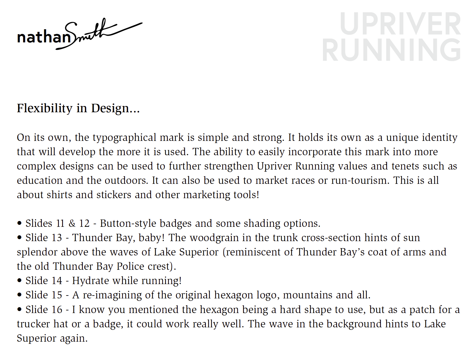

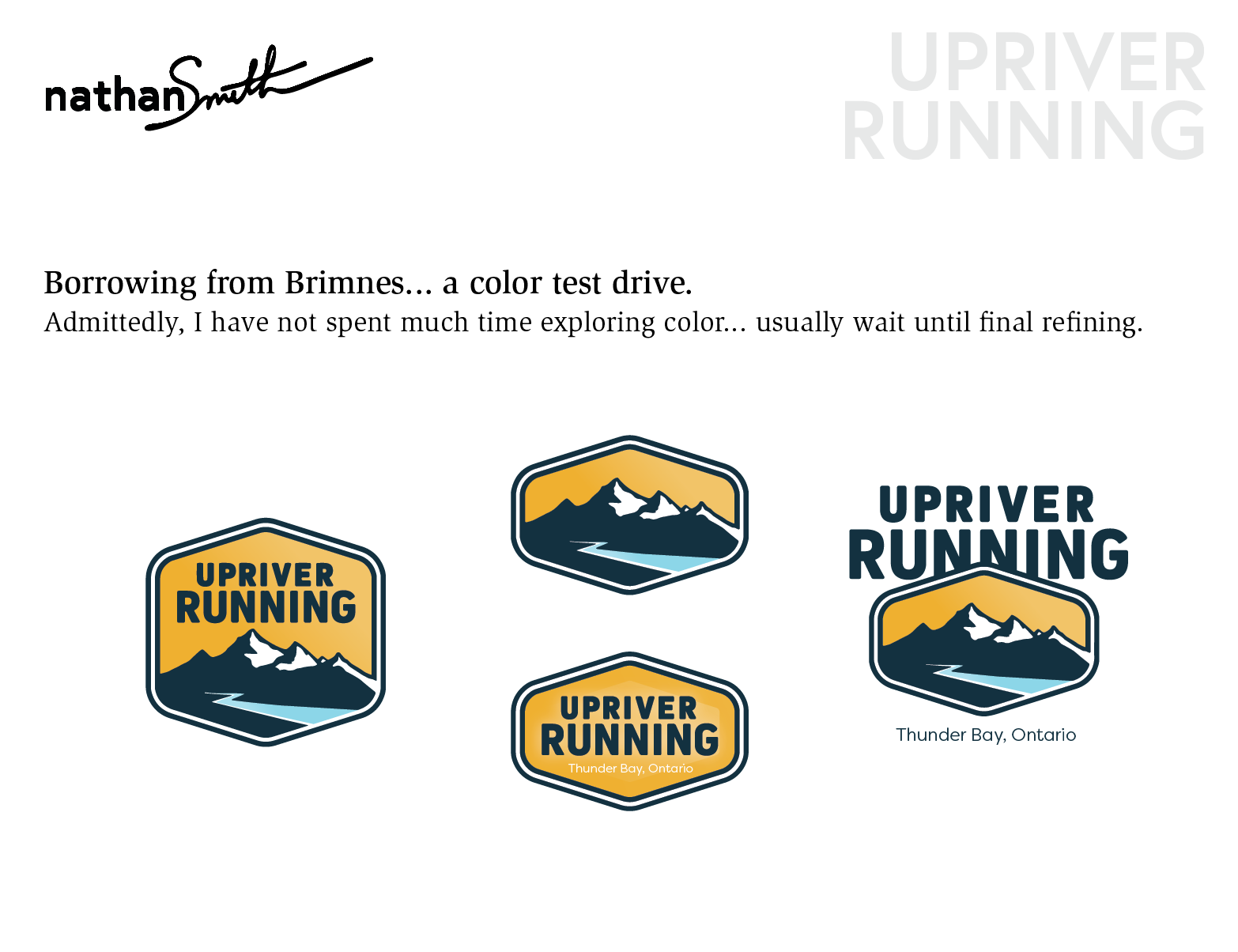
Process (feedback& revision):
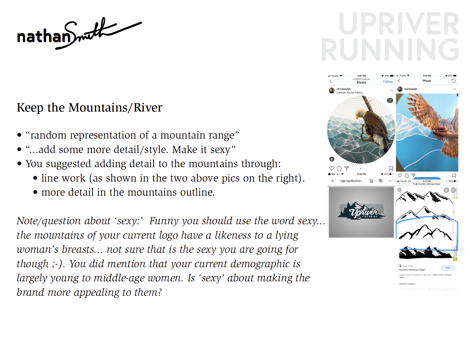
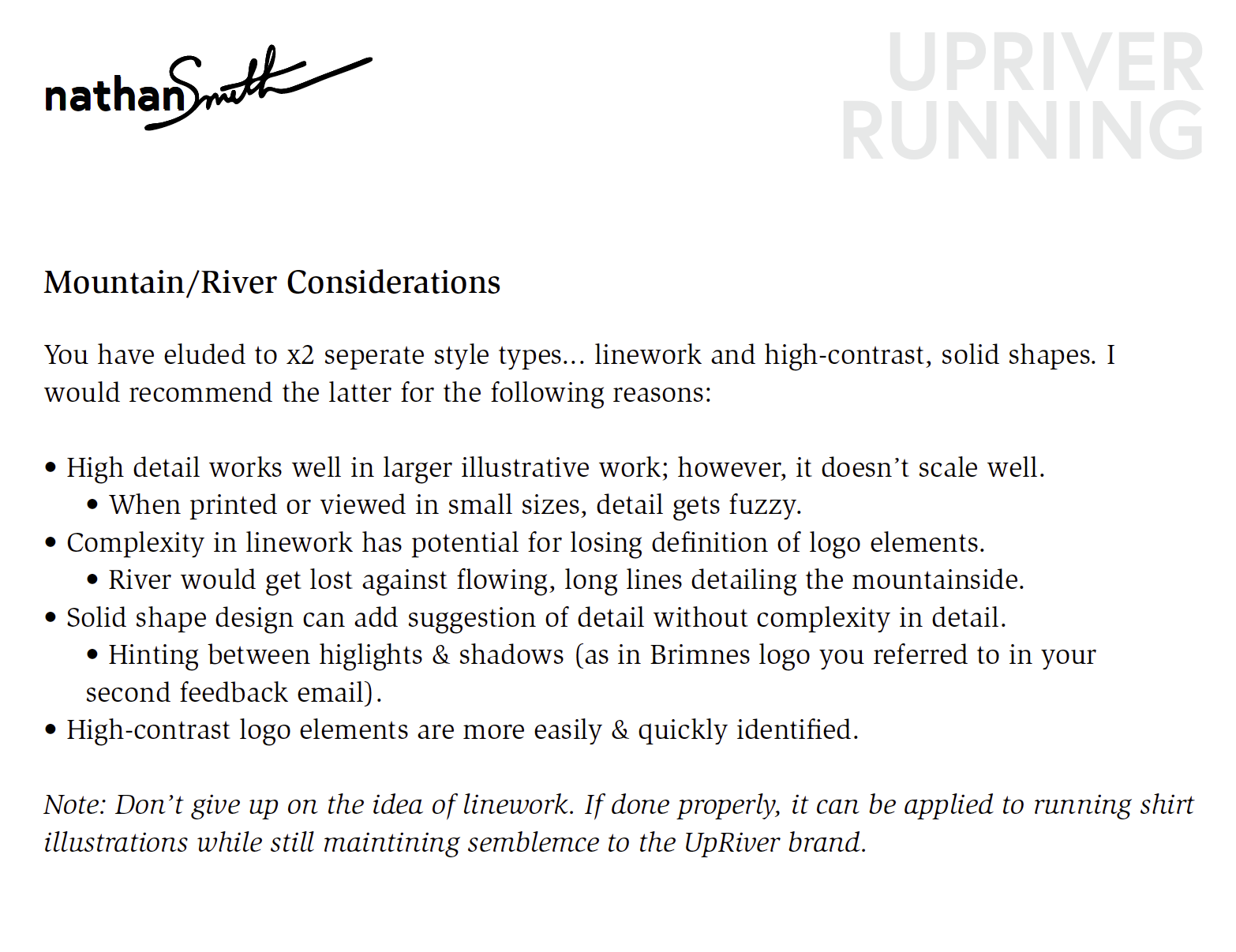
Note - the second grid of images contains details of feedback received and revision plans based on that feedback.
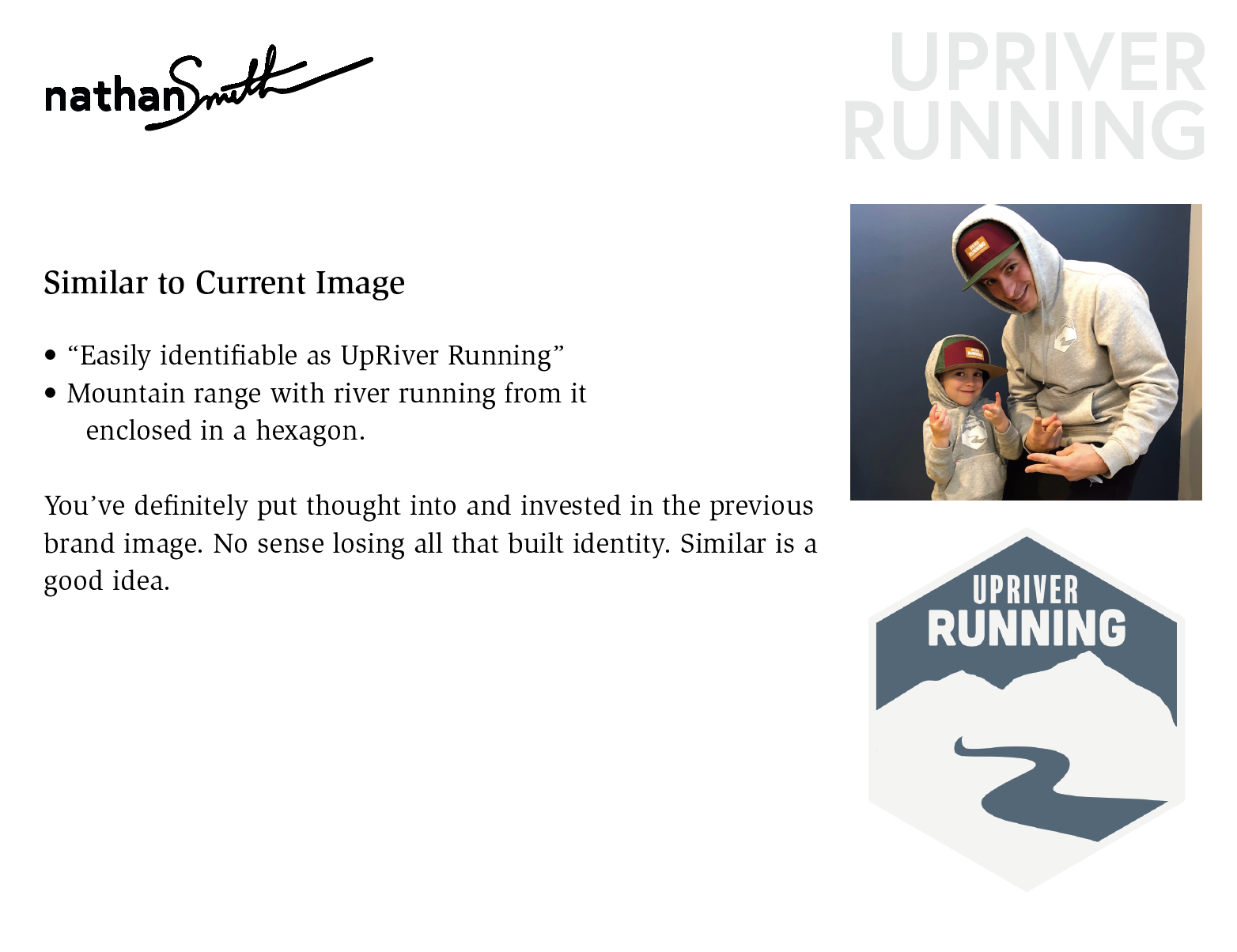
The owners came back requesting a direction toward a more 'familiar' mark borrowing may of the elements from the original logo they had been using. They shared some ideas about styling as well as some of the things they wanted to hold onto from the initial proposed logo.
Supporting design principles/insights were shared to backup a new proposed brand during this second phase. Versatility was explored with different iterations and ideas for color were introduced for consideration. Alternative versions were also shared to sho how the brand could be utilized in various ways and still maintain recognition.
The second phase ended with a meeting and suggestions for some added detail. The brand was refined, and the owners provided with brand assets for print and screen in color, grayscale, and black & white.